Typography - Final Compilation & Reflection
Week 13 | Week 14
Mohamed Hammam Chebel (0342483)|B'DES. Creative Media (Hons)
Typography
Final Compilation & Reflection
Exercises Lettering and type expression
Project 1 Text formatting and expression
Project 2 Font design
Final Project Typography: Expression, Hierarchy, and composition.
Further instructions were posted by Mr. Vinod in the Facebook group (Typography TDS).
The fifth post (final compilation & ref.) will showcase all the final pieces for all exercises & projects, and toward the end an objective reflection of the entire semester (experience, observations and findings). Content of final compilation as follows:
• Exercises: Type Expression (JPG, PDF & GIF) 6 word expression (PDF & JPG), single word animation (GIF) // Text Formatting (PDF only)
• Project 1 (JPG & PDF): Editorial Layout JPG version & PDF version
• Project 2A (JPG, PDF, .ttf): all letterforms (glyphs) on the baseline in one line (including punctuations) in JPG & PDF, generated ttf. font (link) uploaded to your drive (downloadable via the link provided), font design poster (JPG & PDF).
• Project 2B (JPG, PDF & GIF): Poster
• Reflection (overview of the entire semester in an objective and truthful manner).
Exercises Week 1 | Week 5
TYPE EXPRESSION

Fig 1.1
Type expression JPEG
Fig 1.2
Type expression PDF
Fig 1.3
Type expression Animated GIF
TEXT FORMATIING
Fig 1.4
Text formatting PDF
Project 1 week 6 | week 7
Fig 1.5
Editorial layout JPEG
Fig 1.6
Editorial layout PDF
Project 2a week 7 | week 9

Fig 1.7
Letter-forms JPEG
Fig 1.8
Letter-forms PDF
Fig 1.9
Font design poster JPEG
Fig 1.10
Font design poster PDF
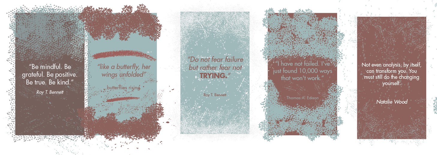
Project 2b week 9 | week 13

Fig 1.11
Poster JPEG
Fig 1.12
Poster PDF

Fig 1.13
Poster GIF
Reflection
EXPERIENCES
At the very beginning of this semester I thought typography is about typing text and printing. After few lectures I began to understand what is it about, and how detailed and complicated it is.
The overall experience while taking this module was good, the most thing I really enjoyed was how clear the instructions were. Mr. Vinod and Mr. Shamsul always reminded us of what to do and how to do it,
So I was pretty aware of what's going on compared to other modules. Also, the demos and tutorials were clear and well explained, but honestly as a new student I had difficulties at the beginning with time management, but I got used to this pace, thanks to Mr. Vinod's system, I am now more organized than ever.
OBSEVATIONS
I noticed that typography needs more attention and effort than other designs like illustrations etc...
Text formatting, alignment, kerning,point size, choosing the right typeface depending on the meaning of the artwork, we should pay attention to all of this and more in order to come up with a neat looking design.
I also noticed how important is consistency in typography in general, whether when creating a typeface or formatting a text or creating a poster design, a normal person can notice the imperfections in a typographical design, so it should be perfectly balanced and consistent.
Not to forget the amount of time a designer spend to make a typography artwork.
FINDINGS
I learned a lot of things after taking this module.
First, I learned how to use Adobe Photoshop, Illustrator, In-design to format text, to make type expressions, to create a typeface from simple sketches , to make simple animations in Photoshop then export them as GIF files, to make posters and add textures and graphical effects to the typography.
I learned how to use Font-Lab to generate my own font.
Second, I learned to update my personal blog with my latest designs, and explaining the idea behind each artwork I post, and describing the final design for the observer.
Third, I found typography a very interesting subject after being aware of its importance in the design world.
Finally, I gained self discipline, I became organized and productive thanks to this module and to my lecturers.

Comments
Post a Comment