Typography - Project 2B
week 10 | week 13


This book explains the general basics of logo design, since I was interested in typography, I just read the typography chapter.
Mohamed Hammam Chebel (0342483)|B'DES. Creative media (Hons)
Typography
Project 2B | Expression, Hierarchy & Composition
Instructions
Final Project|Typography: Expression, Hierarchy and Composition
This project is about making a typographical poster, containing a quote or a meaningful phrase. We are supposed to use all our gained knowledge during the past weeks, we are asked to express the meaning of the phrase typographically, using minor graphical elements as usual.
We are allowed to add texture and background, also colors to the poster.
we have to make a still version of the poster, and an animated version too.
Week 10 briefing and sketches
In today's live lecture Mr. Vinod explained the overall instructions of the final project, also he asked us to choose a line for the poster.
I posted my chosen lines on Facebook so I can get the approval of the lecturer.
Mr. Vinod approved my line which was " Grateful for where I'm at,
Excited about where I'm going."
After that I started on doing sketches on how my poster will be.
I went ahead and sketched some variations on Photoshop.

Fig 10.1

Fig 10.2

Fig 10.3
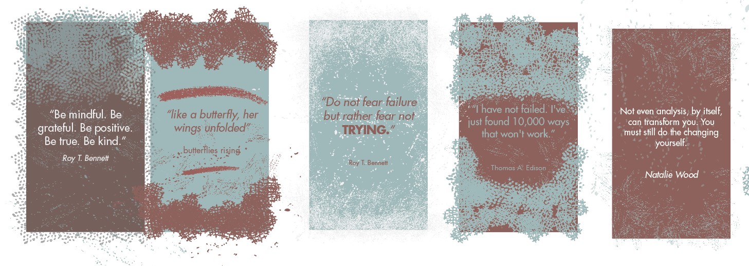
Those are rough sketches of my ideas, I did it on Photoshop so I can change colors easily, and make more variations.
Week 11 Consultation
This week Mr. Vinod asked us to post our progress on the poster (digitized version). I posted four variations for feedback.

Fig 11.1

Fig 11.2

Fig 11.3

Fig 11.4
After showing these four variations to the lecturer he asked me to stick to the second one [Fig 10.2]. Also he advised me to work more on the kerning and to make the letters closer to each other, and to pay attention to small details.
Week 12 Consultation
In today's live session Mr. Vinod asked us to show our progress for the final project, I posted my ideas for feedback.
I made a black background with white type. I chose futura bold for the poster. I kerned the words so they appear even more condensed as Mr. Vinod advised me last week.
I applied a texture I found online to the whole poster (background and line).
here are my variations for this week.

Fig 12.1

Fig 12.2

Fig 12.3

Fig 12.4

Fig 12.5

Fig 12.6

Fig 12.7
Feedback was given, refer the the feedback section below.
Week 13 Absent.
I couldn't join today's live consultation due internet issues I faced, I messaged Mr. Vinod privately right after I had internet access.

Fig 13.1
texture
I found this texture online after our lecturer suggested to use a background texture.

Fig 13.2
Formatting/Alignment

Fig 13.3
Frame by frame GIF animation
this step took a long time to do, I made 25 frames, used the eraser tool to erase one piece at a time (from the tire tracks).
I did the same process as in the first exercise [type expression].

Fig 13.4
Final poster JPEG
Fig 13.5
Final poster PDF
Fig 13.6
Final poster GIF
I decided to invert the color of the background and the text, it creates more contrast, I applied this paper texture on both the text and background.
after that I reduced the texture on the text using the eraser-tool as Mr. Vinod advised me last week.
I applied a tire track in the bottom of the poster after the word GOING to express movement. (this graphical element and animation was approved by the lecturer in the consultation session).
All work was done on Adobe Photoshop as I find it easier for applying effects and textures also to do simple animations.
Feedback
Week 10
specific feedback
your sketches look organic, you cant apply the graphical elements (the leafs). try to express typographically, choose a suitable typeface.
General feedback
Final JPEG must be exported (BW) 300 dpi and uploaded to your e-portfolio
You must embed your Final PDF layout (only final in PDF format)
You must make your document visible to everyone in Google Drive
If there is no formal lecture in that week, you can make mention of what demonstration of briefing occurred during class (In-Design Demo/etc)
Further reading must be accompanied with an image of the book or the site.
your sketches look organic, you cant apply the graphical elements (the leafs).
Week 11
specific feedback
work on the kerning, make the letters closer to each other.
improve the first design.
try to reduce the empty areas( the blacks)
Express the meaning using one word or letter.
Week 12
specific feedback
Organize and format feedback properly on the feedback sheet, complete any missing feedback.
if you were absent write it down on that week.
reduce the texture on the typeface, keep it as it is for the background, go with the footprint or the tire tracks. try to make the tire tracks in black color.
Week 13 Absent due to internet issues
Reflection
EXPERIENCE
This last project was easier to execute compared to the previous projects, since I went through text formatting and expression exercises, this was a piece of cake. Yet it was hard coming with Ideas for the expression and animation, also choosing the right typeface and texture was a bit time consuming.
We had plenty of time to show our progress and have feedback, this allowed me to have more time to think and explore more.
After finishing this project I became more detailed in my descriptions and explanations.
Also I have better understanding of typography design.
OBSERVATION
While doing this project I did a lot of visual exploration on Pinterest, I noticed that most posters don't use a lot of graphical elements. Yet, anyone can understand the meaning of those posters just by looking at letters, type expression can be stronger then an entire illustration. I will try to improve my type expression because it's crucial at any graphic design artwork.
FINDINGS
While designing the poster I've found several ways to apply texture to the type also to the background on Photoshop.
Also, I found that visual exploration is so important to get the inspiration in order to do a design.
I used Photoshop to do this design, i usually use in-design or illustrator for typography, i found it easier to add graphical elements and effects.
Further reading
During this project i was reading this free book I found online by blusodapromo.com

Fig 14.1
I learned the importance of consistency and the use of white-spaces.
Also this book shows the most used fonts by designers.
Typography can be a very complicated topic but understanding some simple concepts and rules can result in solid typography and help make good graphic design great.

Comments
Post a Comment