Typogrpahy - Exercises
17.04.2020 | 2020 satrting and ending date
Mohamed Hammam Chebel (0342483) / B'des. Creative media (Hons)
Typography
Exercises | Type Expression & Type Formatting
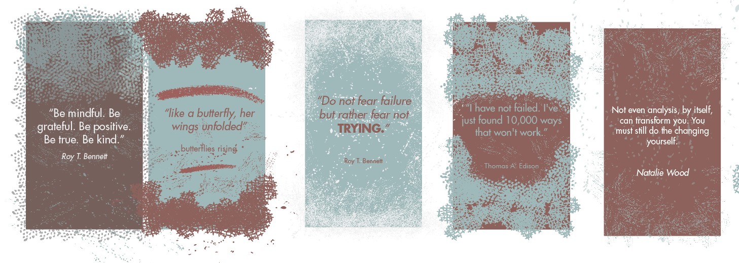
The words given :


Findings

Mohamed Hammam Chebel (0342483) / B'des. Creative media (Hons)
Typography
Exercises | Type Expression & Type Formatting
LECTURES
Week 1 INTRODUCTION
In the first live lecture we were briefed about this module, I met our lecturers Mr Vinod Nair and MR Shamsul Hamimi. They went through all the details about assignments and projects etc...
It was really helpful, now I feel like I can start my journey.
The lecturers assigned us for an exercise for this week, they explained the methods used to accomplish this task in detail.
We were introduced to some fonts and some other students artworks, which inspired me and motivated me.
As I did Arabic calligraphy a long time ago, I really appreciate the value and importance of the letter, I hope I learn more about this amazing domain.
the fonts for this semester are:
Week 2 TYPOGRAPHY DEVELOPMENT


Week 4 INSTRUCTIONS AND DEMONSTRATION (Formatting text).
In today's live lecture Mr. Vinod did a demonstration on text formatting using Adobe In-design. I was familiar with most of the information in the demo because I did the formatting text exercise before the live class, after he finished with explaining and giving instructions, we were given time to practice.
After we done practicing the lecturer reviewed our work on formatting text exercise.
finally the lecturer briefed us with the coming project 1" Editorial Text Options" and we were asked to start with doing sketches for our ideas about the overall look of the project.
In the first live lecture we were briefed about this module, I met our lecturers Mr Vinod Nair and MR Shamsul Hamimi. They went through all the details about assignments and projects etc...
It was really helpful, now I feel like I can start my journey.
The lecturers assigned us for an exercise for this week, they explained the methods used to accomplish this task in detail.
We were introduced to some fonts and some other students artworks, which inspired me and motivated me.
As I did Arabic calligraphy a long time ago, I really appreciate the value and importance of the letter, I hope I learn more about this amazing domain.
the fonts for this semester are:
- Bembo Std
- Futura Std
- Gill sans Std
- ITC Garamond Std
- ITC New Baskerville Std
- Janson Text Lt Std
- Serifa Std
- Univers LT Std
Week 2 TYPOGRAPHY DEVELOPMENT
Before going through Friday’s class, I reviewed the you tube video
the lecturer has uploaded which is about the historical development of
typing.
In this lecture I learned a lot of important information about typing
which I didn’t know about before.
At the beginning writing was scratching symbols into different materials
like rocks and wood etc. typing started with Phoenician and developed into
Roman, Greeks changed the direction of writing from left to right, also
the orientation of the letter forms.
This huge development was from 1000 B.C.E to 100 B.C.E

Fig 2.1
Week 3 LABOR DAY
For today, no class took place because it is labor day, so I dedicated
this day to do some self-learning, I used the videos provided In the
lecturer’s you tube channel, I went through all lectures posted there and
took notes so I can I have a general idea on the coming lectures.
Our lecturer Mr. Vinod provided a zoom link on Facebook for an online
session to review animation exercise despite the holiday.

Fig 3.1
Week 4 INSTRUCTIONS AND DEMONSTRATION (Formatting text).
In today's live lecture Mr. Vinod did a demonstration on text formatting using Adobe In-design. I was familiar with most of the information in the demo because I did the formatting text exercise before the live class, after he finished with explaining and giving instructions, we were given time to practice.
After we done practicing the lecturer reviewed our work on formatting text exercise.
finally the lecturer briefed us with the coming project 1" Editorial Text Options" and we were asked to start with doing sketches for our ideas about the overall look of the project.
INSTRUCTIONS
Week 1
EXERCISE 1: TYPE EXPRESSION
In this exercise we have to type six different words given by our
lecturers in a way that it expresses its own meaning, without using any
graphic manipulation just words. This task should be done on Adobe
Illustrator. We were briefed on how to work on this exercise step by step
via You Tube videos posted and done by Mr Vinod, so the process is not
difficult to do, on the other hand, we have to be creative and make our own
type expressions.
The words given :
- Drown
- Fly
- Loud
- Hidden
- Push
- Disappear
Sketches
First, and before doing the work on the software, I did some pencil sketches to visualize my ideas.
First, and before doing the work on the software, I did some pencil sketches to visualize my ideas.
These are my sketches for type expression.

Fig 1.1 Type expression sketch

Fig 1.2 Type expression sketch

Fig 1.3 Type expression AI
Illustrator
After I finished with the sketches. I moved to work on Illustrator. I followed the lecturer's instructions in order to obtain this result. The image below represents the first attempt to illustrate my ideas into the software (Adobe Illustrator) .
After I finished with the sketches. I moved to work on Illustrator. I followed the lecturer's instructions in order to obtain this result. The image below represents the first attempt to illustrate my ideas into the software (Adobe Illustrator) .

Week 2
Exercise 2 ANIMATION


Week 3
Exercise 3 FORMATTING TEXT
Progress

For this task I used In-design software for the first time, It looked complicated at the beginning, but after watching the lecturer tutorials I began to understand its functions. I followed the instructions in the you tube tutorials to do business card and the letter task.

Exercise 2 ANIMATION
Today, the lecturers reviewed our work for exercise one (type
expression) and provided feedback and comments, you can see it in the
feedback section below.
Also we were assigned for a new exercise (animation ).
In this exercise we should animate one type expression of our choice
using Photoshop and Illustrator. We have to express the meaning of the
word using motion.
A detailed video was posted on the lecturer’s you tube channel, contains
an explanation on how to make the word animation.
I followed the step by step tutorial, doing the exercise wasn’t a
problem. Thus, I had to come with the idea which is the trickiest and
time-consuming part.
Here is my progress of word animation
Fig 2.1
In the first step of this process I typed the word "drown" into
Illustrator using serifa font. I duplicated the pages so I have frames to
work on, I kept on moving letters individually and repeating these steps
until I was satisfied with the amount of frames.

Fig 2.2

Fig 2.3
After I was done with creating frames in Illustrator, I exported the
files as jpeg to Photoshop so I can work on animation. I followed the
instructions on the you tube video provided by the lecturer to achieve
the result below.
Fig 2.4
GIF animation
for the word "drown"
GIF animation
for the word "drown"
Week 3
Exercise 3 FORMATTING TEXT
Progress

Fig 3.1
Formatting text exercise
Formatting text exercise
For this task I used In-design software for the first time, It looked complicated at the beginning, but after watching the lecturer tutorials I began to understand its functions. I followed the instructions in the you tube tutorials to do business card and the letter task.

Fig 3.2
Formatting text exercise
Formatting text exercise
Fig 3.3
Text formatting PDF
After the feedback I worked on improving my work
Fig 3.4
Formatting text final
FEEDBACK
Week 1
On the 25th of April 2020, during the live meeting on zoom with the lecturers. Mr Vinod and Shamsul had reviewed my work on the first exercise ( type expressions ) which I've posted in the section above.
Well, Mr Vinod provided me with comments and advice regarding my work.
First he suggested to create an 0.5 mm outline for the word "DISAPPEAR" and to color it with a light grey color to make it look like it's fading or disappearing .
Second, Mr Vinod advised me to work more on the letter "O" in the word " DROWN", by that he means to work on it's position and rotation.
Third, he told me to redo the word "LOUD", because it's lacking the meaning or the expression itself, in other words it doesn't really represent the meaning of the word.
Finally, he gave me a general advice, which is changing the fonts for each word because I used the default font in the editing software, the lecturer has provided us with 9 different typefaces so I have a wide range of styles to chose from.
The lecturer's feedback was helpful and precise. Now I can improve my work.
Week 4
today Mr. Vinod reviewed my work on formatting text and here is his feedback.
work on cross alignment between the headlines and the body text. Fit the text boxes perfectly into the columns. delete awkward paragraph spacing.
copy some of the text above and paste it in the lower section of the text box to fill up the empty space.
update blog and add further reading, make the PDF files public on google drive.
REFLECTION
Experience
After going through typography classes with Mr. Vinod, I have better understanding of typography basics, its history and development, different fonts, typing styles and type faces, and the software used for typing. I'm satisfied and thankful for the lecturers, the live lectures are detailed and clear, so I had no problem following instruction at all.
My questions were answered immediately by the lecturer and feedback was given after reviewing my homework.
I can go back and watch lectures again on Facebook or you tube which is really helpful.
Observation
I always wondered how books and news papers are made, In such a pleasing manner, readable and organized with precised margins and perfect alignment.
Thanks to this class I become aware of how the process is made, I like the details and the hard work behind typing. Before taking this class, I was thinking that typography is just typing, but now I know its importance and understand its beauty. Now, I am more interested In typography, and willing to learn more.
Findings
I found that the best software to use for typography design work is Adobe In-design, it is a detailed software that is dedicated only for typing.
Also I learned how to do basic animation in Photoshop which was very useful for me. now I can make frame by frame animations and export it into a GIF.
I found that expressing meanings through words can be challenging and time consuming, but it is a powerful way of expression.
FURTHER READING
Relativity by Albert Einstein.
this week I started reading a book I bought before MCO, It's about general
and special theory of relativity by Albert Einstein.
As I went through this book I noticed a lot of detail which I wasn't aware
of before taking typography class. I become more sensitive to details, I
like how the text looks in this book, it is readable and pleasing to see, it
has a lot of mathematical equations and numbers, three fonts are used in
this book, I can differentiate between headlines, examples and
equations.

Fig 1.1
Relativity
the special and the general theory
Albert Einstein
Relativity
the special and the general theory
Albert Einstein

Comments
Post a Comment