Brand Corporate Identity | Project 3

Week
Mohamed Hammam Chebel (0342483) BDE's. Creative Media (Hons)
Brand Corporate Identity
Project 3
Instructions
Progress

Fig 1.1 Color Palette

Fig 1.2 Color Palette/Updated

Fig 1.3 Business Card - Front

Fig 1.4 Business Card - Back

Fig 1.4A Business Card - Back

Fig 1.4B Business Card - Front

Fig 1.5 Letterhead Variation 1

Fig 1.6 Letterhead Variation 2

Fig 1.7 Business Card 2 - Front

Fig 1.7 Business Card 2 - Back

Fig 1.9 All patterns used.

Fig 1.10 Envelope

Fig 1.11A Invitation card - rejected

Fig 1.11B Invitation card Mockup - rejected

Fig 1.12 Business Card 1 mockup

Fig 1.13 Business Card 2 mockup - Front - Final

Fig 1.14 Business Card 2 mockup - Back - Final

Fig 1.15 Business Card 2 mockup - Back & Front - Final

Fig 1.15B Business Card 2 mockup - Back - Final

Fig 1.16 Paper Bag 1 - Final

Fig 1.17 Paper Bag 2 - Final

Fig 1.18A Tote bag 1 - Final
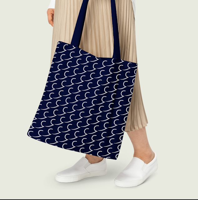
Fig 1.18B Tote bag 1 - Rejected

Fig 1.19A Tote bag 2 - Final

Fig 1.19B Tote bag 2 - REjected
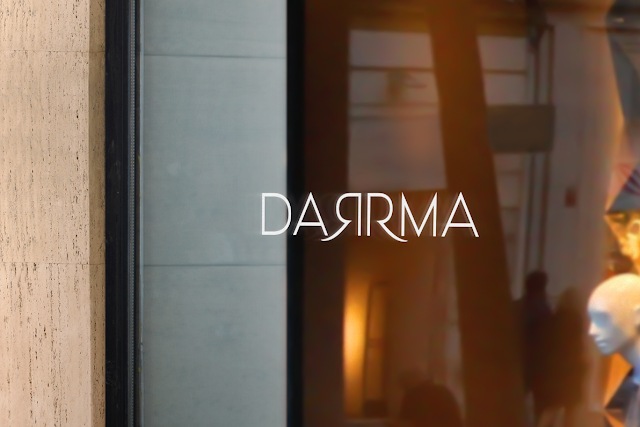
Fig 1.20A Glass window - Rejected

Fig 1.20B Glass window - Final

Fig 1.21 Store signage - Final

Fig 1.22 Store signage 2 - Final
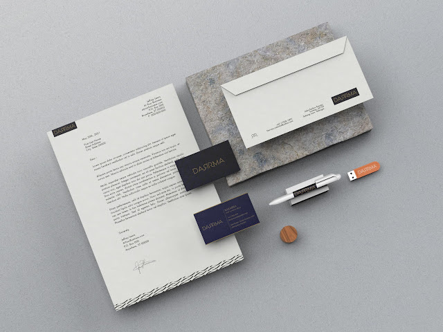
Fig 1.23A Stationary set - Rejected

Fig 1.23B Stationary set - Final

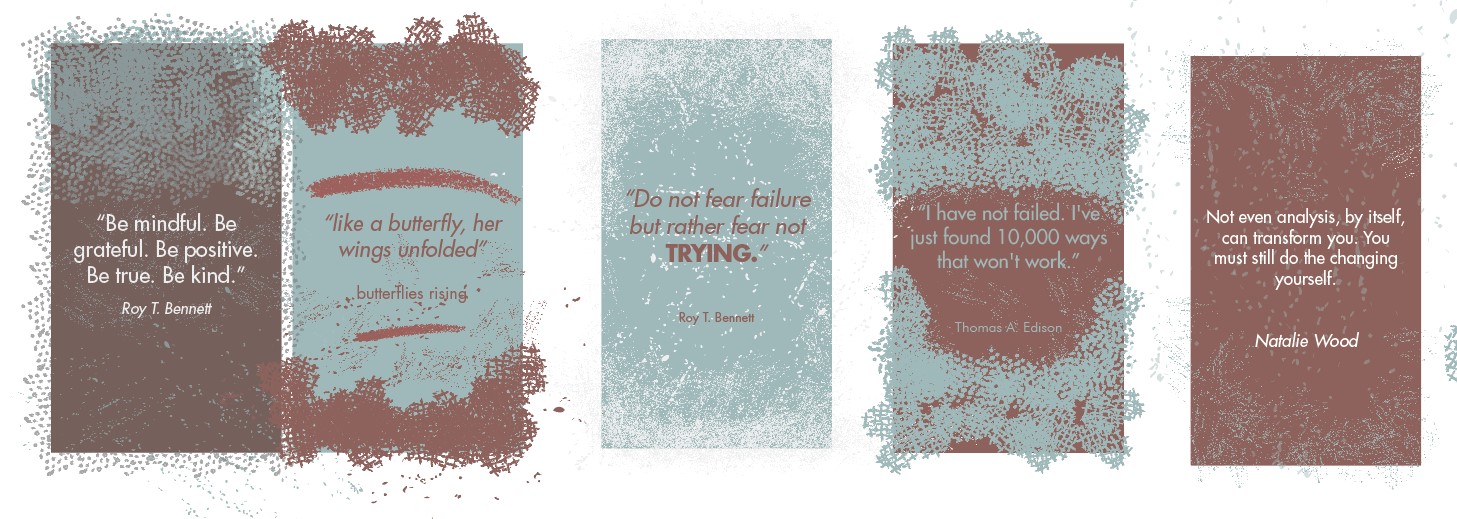
Fig 1.24 Picture editing for communication - facebook

Fig 1.25A communication - instagram - Final

Fig 1.25B communication - instagram - Rejected

Fig 1.26 communication - Facebook page - Final
Fig 1.27 final compilation Stationeries, Communication and Environment
Feedback
Week 7
General Feedback: Try to create your own color palette instead of just using the color palettes you find online. Usually, vertical business cards might look more professional compared to horizontal ones.
Week 9
General Feedback: We don't have to rely on the type of mock-ups we can find online for our designs. Our designs for the collaterals can look different from how it is normally designed (ie shape) as long as it suits our band. Be more creative We can consider doing look books for the brand. For name cards, 1 surface should be for branding and 1 for information.
Week 12
- Go with the blue business card.
- use graphic elements in social media accounts.
- improve visuals on the Instagram page
- overlay typography on pictures.
- Paper bags looks fine.
- Letterhead graphics must be enlarged at the bottom, extend to the corners.
- the logo on the envelope, omit the box.
- the signage is fine.
- work another visual (window) and use patterns.
- Social media posts can be typography, promotions, seasons, etc ...
- Create an Instagram carousel
Reflection
Observation
Doing this project I noticed that finding good pictures online can be a difficult job, finding suitable pictures that work well with the overall design language takes a lot of time and searching skills.
Experience
I had a good experience doing this project as I learned how t do brand applications, how to choose the type of application suitable for the brand in hand, thinking about the target audience and the functionality of these applications is crucial.
Findings
I found that we should design every detail then displaying it on a mockup, we should not use the mockup template blindly, we should be creative and work on all the details.

Comments
Post a Comment