Publishing Design | Task 3 A / Book

Week | Week
Mohamed Hammam Chebel (0342483) BDE's. Creative Media (Hons)
Publishing Design
Task 3A/ Book
Mohamed Hammam Chebel (0342483) BDE's. Creative Media (Hons)
Publishing Design
Task 3A/ Book
Instructions
Layout References
In week 05 class we were asked to look for references for book layouts, here are my references:
Fig 1
Layout References
Determining Grids
Fig 2
Determining Grids
Type Specimen Sheet
Fig 3
Type specimen sheet
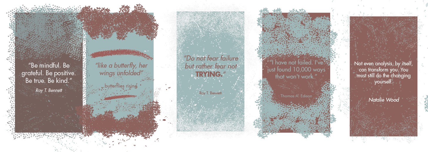
Three typefaces were chosen for the book
- Minion Pro (Bold, Italic, medium)
- Baskerville (Bold, Italic, Roman)
- Times new (Bold, Italic, Regular)
In the end, I chose to go with Baskerville for the headings, pull quotes, and subtexts.
Layout Design
Fig 4
Layout design / First attempt
In this first attempt, you can see clearly that the with of the columns is inconsistent, after I received feedback from Mr. Vinod I chose a specific column width for the whole body text.
Fig 5
Layout design with grids, first attempt.
Fig 6
Layout design, updated after feedback with illustrations
Fig 7
Book cover Layout.
Fig 8
Book, with cover PDF
After making the necessary corrections I added the book cover, and I added a shade of gray to some of the pages to create variation, I kept the black color of the body text against the gray background.
Fig 9
Book, thumbnails.

Fig 9.1
Book, thumbnails JPEG.

Fig 9.2
Book, thumbnails JPEG

Fig 10
Book cover spread, Layout
For the book cover, Mr. Vinod told me to make the title even bigger and move it to the right to readable.

Fig 11
First page

Fig 12
Final Book design Spread 1

Fig 13
Final Book design Spread 2

Fig 14
Final Book design Spread 3

Fig 15
Final Book design Spread 4

Fig 16
Final Book design Spread 5
 Fig 17
Final Book design Spread 6
 Fig 18
Final Book design Spread 7
 Fig 19
Final Book design Spread 8
 Fig 20
Final Book design Spread 9
 Fig 21
Final Book design Spread 10

Fig 22
Final Book design Spread 11

Fig 23
Final Book design Spread 12

Fig 24
Final Book design Spread 13

Fig 25
Final Book design Spread 14
HTML5 Flipbook
Fig 2.1
Flipbook First attempt
Fig 2.2
Flipbook Final
after feedback
Fig 2.3
Flipbook Final
Week 14 - Added the Taylors Press logo to the book cover
Feedback
Week 06
- watch Youtube lectures (text formatting)
- Format the text properly before proceeding with the design.
- get rid of the widows, rivers, and awkward spacings
Week 07
- Please make sure your Feedback is updated. Ensure that Task 1 & 2 Eportfolios are complete for marking on Week 8 (ILW)
Week 08
- Public Holiday
Week 09
- complete the book
- add visuals, refer to form and movement exercises.
- add page numbers.
- Make sure that you make the page cove in a separate file and add it to the compilation PDF file.
Week 10
- Add a light shade of grey to the blank pages, use the grey from your artworks.
- You should have 32 pages including the book cover.
- make the book cover as spread layout in the thumbnail layout.
- try turning on hyphenate to a specific paragraph only and kern one phrase so you can get rid of the rivers in the body text.
- complete the blocks of text on page number 19.
- refer to #e_booknavigation on the Facebook group ad watch the tutorials.
Reflection
Observation
While doing the book project I noticed that there are important steps to take before proceeding with placing the text, at first I thought a book designer should only format and place textual information into a specific grid layout, but later on, I understood that there are many phases to go through, determining the grids, choosing a suitable typeface for the content, making relevant illustrations and placing them carefully, choosing interesting margin spacings, etc...
Experience
In this project, I experienced few challenges, for example, the selection of the grid layout took me a long time, I kept looking into references trying to create my own layout, in the end, I used the Van De Graff method to determine the margins and some book layout references to determine the guides.
Findings
I found that I totally missed how to use In design software and how to format the text properly, so I made a lot of mistakes formatting the text, but after I got Mr. Vinod's feedback I watched the typography lectures he recorded in the previous semesters and applied all the things I learned, it helped me get faster at formatting text and playing with the software.
Further Reading
I watched this YouTube documentary to get a glimpse of the process of bookmaking. I was interested in the history of bookmaking, how did people publish books when there was no technology?
I found this short documentary very informative and inspiring.

Comments
Post a Comment