Advanced Typography - Project 2 (Final)

Week 10 | Week 14
Mohamed Hammam Chebel (0342483) BDE's. Creative media (Hons)
Advanced Typography
Mohamed Hammam Chebel (0342483) BDE's. Creative media (Hons)
Advanced Typography
Final Project | Exploration and application.
Develop a font that is intended to solve a larger problem or meant to be part of a solution in the area of your interest be it graphic design, animation, new media or entertainment design or any other related area not necessarily reflecting your specialization.
or
Explore the use of typeface in your area of interest, understand
its existing relationship, identify areas that could be improved
upon, explore possible solutions or combinations that may add
value to the existing typeface.
The problem
My father's company organizes events and seminars, I have noticed that there is one event for kids that uses a font that is not relevant /suitable for this event.
This event is called NLP for kids, NLP stands for Neuro Linguistic Programming. it is s a pseudoscientific approach to communication, personal development, and psychotherapy created by Richard Bandler and John Grinder in California, United States. Retrieved from Wikipedia.
The event accessories uses a normal font which doesn't reflect the event.

Fig 1.1
One of the event accessories that contains textual information

Fig 1.2
The image used to advertise for the event on social networks (Facebook)
The participants (kids) are given some tools in the events like notebooks and papers, badges.
I wanted to design a typeface that is more friendly and organic, the typeface will be easy to read so kids won't get bored reading the textual information given to them.
Along with that I want to use that typeface for T-shirts that the staff wear in the event, and the banners used for advertising.
The process
Inspiration / references
I was inspired by brush and hand written fonts as they have the characteristics I mentioned above (Organic, friendly).
I used this font as a reference while designing my font

Fig 1.3
Inspiration / Reference font.
As you can see the strokes are not perfect in terms of thickness, however it's not to the point that is distracting or annoying, which is something that I wanted to achieve in my final outcome. At the same time I want the font to look consistent when seen from a distance.
Execution
I wrote the letters by hand on a paper, then took a picture of them. I used them as guides in illustrator.
I started tracing over the letters using the pen tool.

Fig 1.4
Uppercase Letters (Handwritten)

Fig 1.5
Lowercase case Letters (Handwritten)
Here are the letters after the tracing.

Fig 1.6
Traced letters in Illustrator

Fig 1.7
Final Uppercase letters in Illustrator JPEG
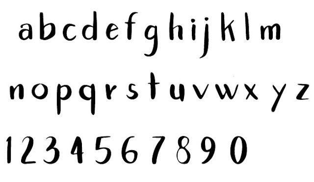
Fig 1.8
Final lowercase letters and numbers in Illustrator JPEG
I made numbers and some symbols since this font is going to be used for minimal textual information for examples the pricing of the event in the posters and banners. Also the symbols will be used on paper sheets that will be given to the participants.

Fig 1.9A
Symbols Illustrator JPEG
Fig 1.9B
Final Letters Ai PDF
The building process of my letters was pretty straightforward So I didn't spend a lot of time designing them, however I refined each letter individually with the direct selection tool to add the imperfections to the strokes.
After that I exported the letters to Fontlab Studio 5 to kern and generate a font out of them,

Fig 1.10
Preparing the letter for exportation to Font lab.
I created an artboard specifically to export the letters, so it is placed correctly in the software, I used the universal measurements of the base line, x height etc... So my letters are placed directly and correctly in the Glyph boxes.

Fig 1.11
Uppercase B Glyph in Font lab.

Fig 1.12
Lowercase B Glyph in Font lab

Fig 1.13
All Glyphs of the letters and numbers, symbols ready to be kerned

Fig.1.14
The kerning process of the lowercase letters

Fig 1.15
The kerning process of the numbers and symbols

Fig 1.15
The kerning process of the Uppercase letters

Fig 1.16
The kerning process of the Uppercase letters
The kerning process was time consuming, but I learned a lot while doing it. I had to kern different combinations of letters, the numbers and the uppercase and lower case letters together (as in names like: Hammam).
I wanted the font to be a little bit stretched out so the letters are sitting comfortably next to each other, the reason behind that is to make the font easy to read by kids.
Then I generated the font and installed it on my pc so I can start with my collaterals.

Fig 1.17
Generated Font ready for installation
Here is the download link for my font:
Scorpiona Hadjrita
Collaterals
For the collaterals as I mentioned in the beginning of this post, I will be making event accessories that are used in the seminar.

Fig 1.18
Gift T-shirt
I thought that I make gifts for the event participants

Gift T-shirt_2


Fig 1.20
Notebooks_1
Children will be given notebooks during the event

Fig 1.21
Notebooks_2

Fig 1.22
Small Notebook

Fig 1.23
Roll-up stand banner
Feedback
Week 10
Specific feedback
- If you are going to design a typeface for D'latour Go ahead start now
- Make sure to make the letters a bit thinner from the letters in D'latour's logo.
Week 11
Specific feedback
- The letters look good overall
- Try to make the vertical stokes identical among the letters h, t ,l ,b etc...
- Refine the letters 4, 8, m.
- The letter u looks bolder than the rest of the letters make it thinner.
- On track keep doing
Week 12
Specific feedback
- Make good use of your letters
- Try to find suitable use for the letters
- Make more collaterals so I can see how this font is used
Reflection
Experience
The process of making the font was the easy part for me because I went through it in the last semester in Typography module when I designed and generated some letters, this time I used a different technic to create this organic font which is tracing with pen tool over a sketch of the letters then refining the letters individually sing the direct selection tool.
However, finding a problem was the hard part for me, because there is a lot of design problems out there and I couldn't decide what to do until I remembered that my father has an event for kids which was the problem I tried to solve by doing this project.
Observation
In this project I felt like I am dealing with a real life problem when I have to meet a certain deadline and present my designs, I had to think like I am an actual designer satisfying a client's needs.
Again, this semester I feel that we are practicing more then we are studying the theories and learning the tools and principals of design, now it is about using that knowledge to solve real problems.
Findings
I found that references are key to inspiration, the reference shouldn't be the same as my desired outcome, it just has to have one small detail that I am looking to achieve in my design, I discovered that I look at references and pick only the characteristics that I want then compile those details along with my ideas into one single project, nothing comes from nothing.
I also found out that a designer should read books even from other fields, a reference is not only a picture or a print, it can be a paragraph from a book!
Further reading

Fig1.0
Thinking With Type by Ellen Lupton
I found this amazing book online in a website format, it is organized into detailed sections, basically this is the bible of typography. It has everything from the basics to the advanced techniques of creating typefaces.
I only focused on the tracing section, I learned a lot from there about the sketching and doodling on actual paper before starting with the digitizing stage of the letters.
This chapter inspired me to build this typeface (Scorpiona Hadjrita), It was my first time trying the tracing method to create a typeface.
The book is laid out in a chronological way which make it easy to navigate and very useful for someone in my case.

Fig 1.01
Anatomy chapter

Fig 1.02
Typeface Drawing chapter

I am very impressed with your post because this post is very beneficial for me and provides a piece of new knowledge to me.
ReplyDeleteWM Capture Crack
Nikon Camera Control Pro Crack
Miracle Box Crack
Traktor Pro Crack
IK Multimedia MODO DRUM Crack
I am very impressed with your post because this post is very beneficial for me and provide a new knowledge to me
ReplyDeleteUSB Safely Remove Crack
FireShot Pro Crack
Grammarly Crack
Filmora Scrn Crack
SparkoCam Crack
NICE BLOG VERY GOOD SOFTWARE...
ReplyDeleteFontLab Crack
ControlMyNikon Pro Crack
Wise Folder Hider Pro Crack
HDRsoft Photomatix Pro Crack
I guess I am the only one who came here to share my very own experience. Guess what!? I am using my laptop for almost the past 2 years, but I had no idea of solving some basic issues. I do not know how to Download Cracked Pro Softwares But thankfully, I recently visited a website named wahabtech.net
ReplyDeleteRoon Labs Crack
Really Good Work Done By You...However, stopping by with great quality writing, it's hard to see any good blog today.
ReplyDeleteFreeprosoft
cracksoftwarefreedownload.com
Anni Crack
3D Coat Crack
I like your all post. You have done really good work. Thank you for the information you provide, it helped me a lot. axcrack.com I hope to have many more entries or so from you.
ReplyDeleteVery interesting blog.
Roon Labs Crack
I like your all post. You have done really good work. Thank you for the information you provide, it helped me a lot. crsoftz.com I hope to have many more entries or so from you.
ReplyDeleteVery interesting blog.
FontLab Studio Crack
Advanced Typography - Project 2 (Final) >>>>> Download Now
ReplyDelete>>>>> Download Full
Advanced Typography - Project 2 (Final) >>>>> Download LINK
>>>>> Download Now
Advanced Typography - Project 2 (Final) >>>>> Download Full
>>>>> Download LINK e0
Advanced Typography - Project 2 (Final) >>>>> Download Now
ReplyDelete>>>>> Download Full
Advanced Typography - Project 2 (Final) >>>>> Download LINK
>>>>> Download Now
Advanced Typography - Project 2 (Final) >>>>> Download Full
>>>>> Download LINK 9i