Publishing Design | Task 3 B / E-book

Week | Week
Mohamed Hammam Chebel (0342483) BDE's. Creative Media (Hons)
Publishing Design
Task 3B/ E-book
Mohamed Hammam Chebel (0342483) BDE's. Creative Media (Hons)
Publishing Design
Task 3B/ E-book
Instructions
Determining grids
Fig 1.1
Determining the grids
I chose the 6*10 grid layout as I found it suits my layout.
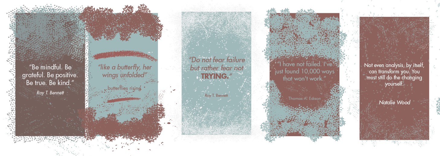
Type specimen sheet
Fig 1.2
Type specimen sheet
- Heading: Futura Bold, Body text: Futura book.
- Heading: Restora light, Body text: open sans regular.
- Heading: Futura Bold, Body text: open sans light.
After trying these three variations, I found that the last one is more suitable for an interactive pdf to be reviewed on screens, as it has the same feel as the fonts used in apps and websites, easy to read and clean.
Brand Guide Progress
Fig 1.3
The first attempt, before feedback
Fig 1.4
The second attempt, After feedback
The brand guideline is still in progress due to some limitations I faced (refer to experience).
Fig 1.5
Brand Guideline for Darrma
The third attempt (Interactive PDF) - after feedback Week 13

Fig 1.6
Brand Guideline for Darrma
Working on buttons - Table of contents
Fig 1.7
Brand Guideline for Darrma
The third attempt (Interactive PDF) - after feedback Week 14
Fig 1.6
Brand guideline for Darrma - Published online
Feedback
Week 11
- Bring the word young down (widow)
- navigation typeface is decorative, not readable
- make a statement in the beginning after the cover page (a value statement).
- insert an image after the value statement
- insert an imprint statement, copyright
- fix line length and rivers.
- make the image bigger, it is not readable (Clear space).
Week 12
I didn't attend class because I faced internet issues.
Week 13
- letter-spacing is not enough.
- leading is not enough.
- get rid of the glow behind the log darrma.
-Try to complete your work by the next class.
- Make it more interactive.
- Make it more interactive.
Reflection
Observation
Thanks to this final project, I learned that a pdf can be interactive and functions as an app, users can navigate easily without having to scroll or jump to pages. I watched several lectures online so I could get a better understanding of how to use the software to achieve good interactivity in the pdf.
Experience
In weeks 12 and 13, I faced major issues with my internet, this caused a delay in progress and submissions.
Findings
I found that interactive pdf with buttons is way more fun to read, nowadays people are used to mobile applications and clicking buttons, a long pdf can be boring to read. An interactive pdf is fun and easy to navigate through, also the interactive pdf text size is bigger than an ordinary pdf so it is easier to read.

Comments
Post a Comment