Publishing Design | Task 1 / Exercises

Week 01 | Week 06
Mohamed Hammam Chebel (0342483) BDE's. Creative Media (Hons)
Publishing Design
Task 1 / Exercises
Instructions
Generating Content and Text Formatting
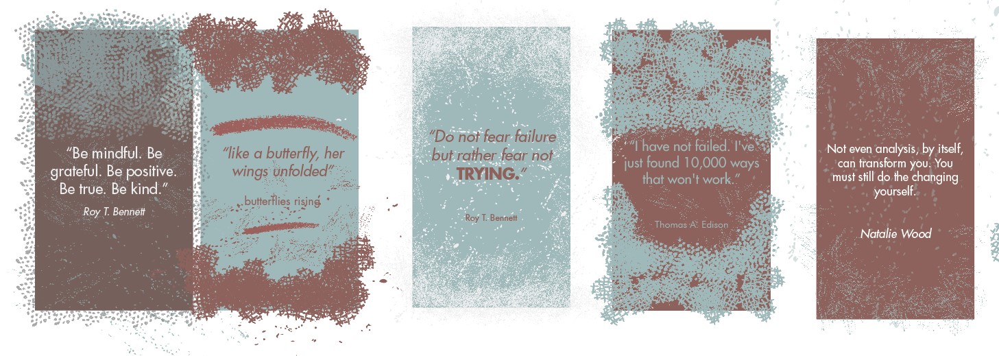
In this exercise, we were asked to generate 3000 words either from a known source or on any subject we are familiar with. The content must be 3000 words minimum divided by 3 chapters, each section of the paper must have at least 2 subtexts and one pull quote.
Here the content I have generated for this task:
Fig 1
3000 Words Exercise
Book mock-up Making
We were assigned to do this simple and fun exercise, where we choose the size of our book using A3 papers and some tools.
The size should be larger than an A5 and smaller than an A4 paper.
I measured and drew their sizes and then decided on a specific size after I held the book in my hand.
I tried these sizes and finally chose the one in Bold:
- 230mm x 178mm.
- 240mm x 168mm.
- 250mm x 183mm.
Fig 2
Book Mock-up Exercise
Using this chosen size I cut all spreads using a cutter and a ruler and made them into spreads, then I bound them together.

Fig3
Final cutout sheet
These are the final sheets (Spreads) after cutting them to the size of my book

Fig4
Final cutout sheet,(Opened)

Fig5
Middle of the book

Fig 6
Final book mockup
Above are pictures I took of the book mockup, you can see that I binned the signatures using the stitching method, after I did some research online on the several methods on how to repair and combine book pages, I choose to go with this method.

Fig 6
Final book mockup, GIF
Signature Folding Systems (8+8=16)
This exercise was a good experience, I had a better understanding of book signatures, usually, books have multiple signatures, each one has 16 pages.
 Fig 7.0
Signature, unfolded

Fig 7
A signature, ( a single A4 folded, not combined)

Fig 8
The middle of the signature (combined, stapled)

Fig 9
The middle of the signature (combined, stapled)

Fig 10
A final signature, stapled, numbered.
Van De Graff
In this exercise, I followed the tutorial video on youtube to get this result. We are asked to do it digitally in In-Design later on.
Fig 10
Van De Graff
Van De Graff In-Design
After doing this exercise physically we were asked to do it in Adobe In-Design.

Fig 11
Van de Graff In-Design

Fig 12
Van de Graff In-Design with text
Then I tested out this layout by putting some text, actually, I went with this same layout for my final book design, as I found the margins interesting.
Grid Systems Exercise
After the signature folding exercise, we proceed to the grid exercise. Mr. Vinod asked us to find 2-3 magazine or book layouts and start dissecting the parts and columns of the magazines.
I chose these three magazines below because I noticed that they have a unique and interesting layout.
Fig 13
Grid system exercise
Fig 14
Grid system exercise / Guides only
Form and Movement Exercises
This was the most time-consuming and most interesting exercise because it took me a week to really understand its importance and be able to create new forms that have meaning and movement in them.
here you can see my progress for this exercise and notice the difference as I move forward and experience more.
Fig 15
1st Attempt BW
1st Attempt BW
Fig 16
1st Attempt BW
1st Attempt BW
Fig 17
2nd Attempt BW
2nd Attempt BW
Fig 18
2nd Attempt BW
2nd Attempt BW
Fig 19
F&M Final Colored
F&M Final Colored
After I got enough feedback from Mr. Vinod, I decided to go with this final layout, we were asked to add a single color to the layout, then add pictures and colors together.
Fig 20
F&M Final Colored
F&M Final Colored
Fig 21
F&M Final Colored with pictures
F&M Final Colored with pictures
Fig 22
F&M Final Colored with pictures
F&M Final Colored with pictures

Fig 23
F&M Final Colored with pictures, Animated GIF
F&M Final Colored with pictures, Animated GIF
Feedback
In the feedback section for this post, the feedback is similar to other posts as the tasks given are related.
Week 01
- Watch youtube lectures and exercises.
Week 02
- Continue doing the subtexts and pull quotes.
- Make the illustrations like Reza Abidini's works (Inspiration).
- Post the exercises in your blog.
- Come up with 4 variations of artworks for next week.
Week 03
- Study Reza Abidini's works and try to come up with a variation inspired by him.
- Make the backgrounds less dark.
- Make the calligraphy in white color on a dark background (Suggestion).
- Add multiple effects to your artworks to make variations if you are doing text only.
- Make more visuals, as much as you can.
- Update the blog with today's exercise.
Week 04
- Look for work of series.
- make other variations.
- don't make your work predictable.
- expand elements or introduce new elements in your artworks.
- Explore and come up with other artworks.
- keep all the artworks consistent, either pixelated or not.
Week 05
- If you introduced a new element keep it.
- Don't be afraid to go outside the margins.
- make the thickness of the rectangle the same as the previous frame.
- I can see the variation in your artworks.
- Try to add an element of surprise
Reflection
Observation
Since the beginning of this semester and while doing these various exercises, I noticed that little details matter in publishing design, we learned the basics that helped us design our final book.
I noticed that these exercises are preparing the student for publishing design, I learned different things that I never thought of, like the structure of a book, signatures and binding methods, etc...
Experience
The exercises were fairly easy compared to the previous semester, however, I learned a lot from these exercises.
Despite that I am familiar with the grid systems, I learned even more about the grids this semester, as I explored different grid layouts online and made my own grid layouts then tested them with text.
Another remarkable exercise in the form and movement exercise, it took a while to understand the meaning and purpose of it and what is its relation with typography and publishing design, but later on and after many attempts to create new forms, I finally got the purpose of it, we can feel the movement of the forms whether they were text boxes or shapes, images, etc...
Our subconscious mind can feel the movement while flipping pages so we don't feel bored reading a book, even a typography book can be enjoyable to read if it has the right grid system and the right forms.
Findings
I found that doing any design exercises or project can take a long time, from gathering references to creating the original idea. the execution process also is lengthy if you are doing it for the first time, but after several attempts, I became even faster at doing exercises and projects.
Also, I found that publishing design is not only pasting text into a grid, each spread of a book is an artwork itself.

Comments
Post a Comment