Advanced Typography - Exercises

Week 1 | Week 0
Mohamed Hammam Chebel (0342483) BDE's. Creative media (Hons)
Advanced Typography
Task 1 | Exercises
Instructions
Week 1
Briefing | Instructions | Overview | Lecture
Today was the first face to face session of this module ( Advanced Typography ). Mr. Vinod went through the MIB attached above in detail, he explained all the tasks that we have to do in the coming 14 weeks.
The lecturer explained the final project in depth and stressed on starting to plan for it from this week, he provided references and reading materials, also examples of our peers which is very helpful.
There are many typographical problems that can be solved, Mr. Vinod gave some real world examples regarding this matter like standardizing number plates, or making a signature font design for a company starting from the font of the company logo. There still a lot of ideas waiting for me to explore.
Lecture 1 Typographic Systems
In the class Mr. Vinod displayed a recorded lecture on you tube. The lecture is about Typographic Systems which are
- Axial system: All the elements are organized to the left or right of a single axis.
- Radial system: All elements are extended from a point of focus.
- Dilatational system: All elements expand from a central point in a circular fashion.
- Random system: Elements appear to have no specific pattern or relationship.
- Grid system: A system of vertical and horizontal divisions.
- Transitional system: an informal system of layered banding.
- Modular system: A series of non-objective elements that are constructed in as a standardized units.
- Bilateral system: All text is arranged symmetrically on a single axis.
Lecture 1
EXAMPLES

Fig 1.1 Axial system

Fig 1.2 Radial system
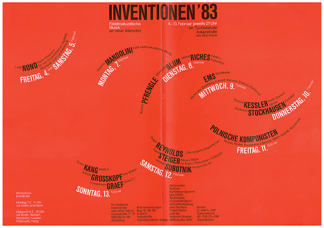
Fig 1.3 Dilatational system

Fig 1.4 Random system

Fig 1.5 Grid system

Fig 1.6 Transitional system


Week 2
Exercise 1 Typographic systems
After going through the You Tube lecture and In-Design tutorials, I was ready to start this exercise.
In this exercise we must come up with two variations for each typographic system using In-Design software.
Here are my variations before feedback. and my process

Fig 0.1
Modular system guides view

Fig 0.2
Radial system guide view

Fig 0.3
Dialatational system
Guide view

Fig 2.1
Axial system 1

Fig 2.2
Axial system 2

Fig 2.3
Random 1

Fig 2.4
Random 2

Fig 2.5
Dilatational 1

Fig 2.6
Dilatational 2

Fig 2.7
Radial 1

Fig 2.8
Radial 2

Fig 2.9
Transitional 1

Fig 2.10
Transitional 2

Fig 2.11
Bilateral 1

Fig 2.12
Bilateral 2

Fig 2.13
Modular 1

Fig 2.14
Modular 2

Fig 2.15
Grid 1

Fig 2.16
Grid 2
Typographic systems Exercise
PDF
Week 3
Exercise 2 Type and play
I was inspired by this delicious fettuccine, I noticed the letters

Fig 3.1
Reference

Fig 3.2
Identifying letters
I noticed the letters P A S T A L

Fig 3.3
Tracing letters

Fig 3.4
Refining letters 1

Fig 3.5
Refining letters 2

Fig 3.6
Refining letters 3

Fig 3.7
Refinement

Fig 3.8
Reference font
Brush Script MT Italic
Since the letters are extracted from pasta I wanted to refer to an organic brush font. I noticed the difference between the strokes.
Also I noticed that all letters have curved endings, so I refined my letters even more using the direct selection tool and the "- ,+" Pen tool to edit the anchor points and play with the paths until I was satisfied with the result.

Fig 3.9
Letter P

Fig 3.10
Letter A

Fig 3.11
Letter S

Fig 3.12
Letter T

Fig 3.13
Letter L
As you can see above the refinement process in detail, I used rulers as the X height and the Cap line for the letters, I also used perfect circles to help me and guide me while I am modifying the curvatures in the letters.
I used straight lines for the long strokes as in L, A, P, T
The letter S was to most challenging one, since it has several curves.

Fig 3.14
Final letters
These letters were extracted from fettuccine which is a kind of Italian pasta, and it happened that I extracted the letters L, P, A, T, S. which are perfect to write the word LPASTA "el pasta".
Fig 3.15
letters PDF
(before feedback)
Feedback was given on Wednesday 16.09.20
I refined my letters even more after Mr Vinod provided me with some suggestions
Here are the final letters after Feedback
Fig 3.16
Final letters feedback PDF
Week 4
Exercise 3 Type and play part two
In this exercise we are to design an A4 poster contains imagery and typography.
I was inspired with this picture which I found on Pinterest

Fig 4.1
I wanted to make a portrait out of words
So I downloaded a picture of my father and opened it in Photoshop and started editing the picture colors and tones.

Fig 4.2
Vintage poster
REFERENCE

Fig 4.3
The picture used for this exercise
To achieve such result the letters should be all upper cases, also the kerning is important

4.4 Portrait
Fig 4.5 Portrait final
Feedback
Week 1
No feedback was given, this week's session was a briefing session
Week 2
- General feedback:
- increase the leading and the paragraph spacing for the body text.
- the information must be in a logical order.
- make any lines 0.5 in stroke size.
- Specific feedback:
- For the axial system reduce the numbers size by 0.5 pt.
- Increase the leading and the paragraph spacing.
- For the random system your work is good and acceptable.
- Reduce the non objective elements size.
- Dilatational system variation n 1 looks acceptable,
- complete the other one.
- Complete the other variations.
- leading paragraph spacing
- either left align or right align the text in the names section
Week 3
- General feedback:
- Keep the characteristics of the reference image in your letters.
- Specific feedback:
- good extraction of the letters.
- either left align or right align the text in the names section.
Week 4
- General feedback:
- Specific feedback:
- snip or cut the tips at the ending of each letter, or curve them, they are too sharp.
- overall good job with the letters.
- Good job with the poster.
Week 4
- General feedback
- the key artwork need to be in black and white, If it doesn't stand out in black and white it's not going to work with color.
- set the sharing settings to "not restricted" for your blog embeded files.
- study your references not just look at it.
- Specific feedback
- no problems there relatively good job
- It makes no sense if you use 50's style on the key artwork for punk topic
Reflection
Experience
The exercises phase was a really interesting one, I didn't have to worry about how to do the exercises since I already went through the "HOW" in the last semester. Now I focused more on applying the principles that we learned to my artworks, I have more time to work on the artwork without struggling with the software.
I learned new useful things like the typographic systems which are crucial as text formatting, It helped me to build my artboard before beginning to add text to it, for me, typographic systems are the skeleton of an artwork.
Observation
From the very beginning I noticed that this semester is different from the first one, in the first semester we learned the basics of typography and how to use the software needed to come up with a design.
Now it's more about creativity and problem solving through artworks.
In this semester we have to read articles and books which will help with finding the idea of the last project.
Findings
In these four weeks I found out that I just began typography, the last semester was just a warm up or an introduction to this semester, I found these exercises very useful, I consider them as a training for what to come, now I'm prepared for the coming projects.
Further reading
For the reading materials I went with these two books that Mr. Vinod has posted in the Facebook group.

Fig 1.1
Typography Referenced
by Allan Haley et al
This book helped me at the beginning of this semester, It refreshed my mind and enlightened me to new things, I found the historical part of the book very interesting because I was always curious about how did type begin and the ways that people used to design and write with. I also noticed that modern typefaces and different designs came from the earliest letters like roman and Greek murals.
Today's type is just a refined version of the earliest one. it took ages to reach this level, that shows the importance of lettering and designing a typeface.
Another point that attracted me in that book is the principles of typography, I was fascinated by how delicate a designer should be when making a typeface, also the amount of rules that he should follow in his designing process, typography is a science more than an art!
I found that this domain is so deep and diverse and worth studying.

Typographic systems
by Kimberly Elam
I skimmed through this book after going through the typographic systems lecture by Mr. Vinod to get a deeper understanding of this topic.
the book has a lot of examples and artworks which helped with my exercise.
It helped me to understand the modular system even more, so I went through the exercises smoothly.

Comments
Post a Comment